branding / copywriting / web design + build
Assembly.
When cult-fave Burgerism founder Mark contacted us to design a brand for his new food project, we were excited to work with one of Manchester’s fast food royalty. He wanted to take their success and help other amazing operators grow and scale with shared high-street kitchens and food halls in sunny Manchester and beyond. We worked on the look and feel, landing page design, and a few workshops to help Mark come up with the name and TOV!
We’re so happy to introduce Assembly: a multi-venue space that focuses on cross-ordering and celebrates collab-eating; guests can dine-in, collect, or order from their sofa for maximum convenience.
Really, who better to work with Mark on this than two self-proclaimed ‘professional eaters’?
Build me up,
buttercup.
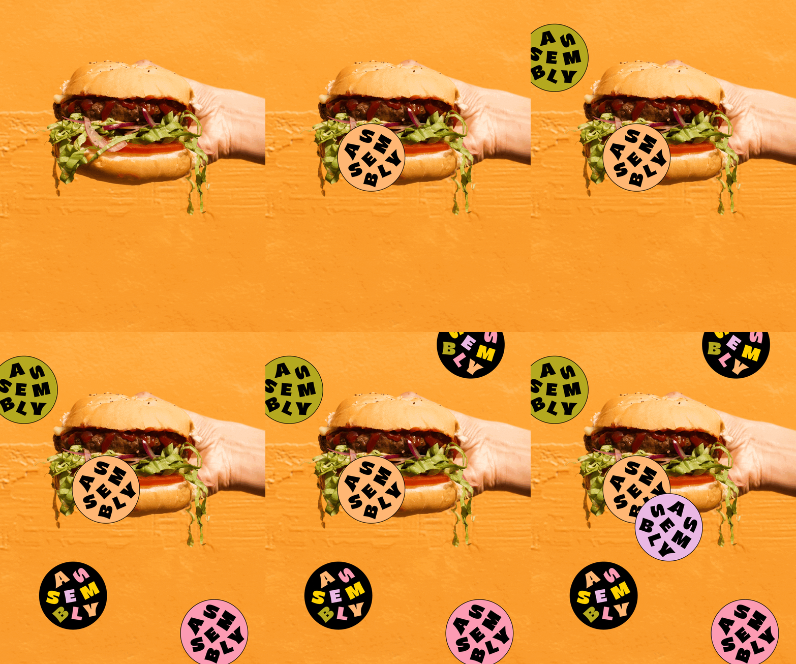
From the colour palette to logo arrangement, from what they say to how they say it; the branding for Assembly had to be warm, playful, and inviting. It had to be its own unique standalone brand that also could put their rotating vendors in the spotlight. We played on the idea of ‘assemble’ as a verb and a noun (ah, hello GCSE English) and made de-construction an integral part of the brand. The tumbling letters are adorable, don’t you think?
Authentic eating.
Assembly has two audiences: the dedicated eaters and the rotating partnering restaurants who’ll share the space and make your cross-ordering dreams come true. We designed and built a landing page as a ‘shop window’ situation, to inform, generate interest, and get both parties excited to join. Plus, we threw in a how-to-Assembly guide with a few cute illustrations to help show the whole thing works.
Our brand book included tips on photography (spoiler: put down the cutlery and use your hands to eat a chicken wing, you troubled individual). We carried through the TOV and made some fast-food packaging-inspired stickers for an added touch of personality.
This is a super-early-stages concept but we’re excited for what’s to come from the minds behind Burgerism!


